Project Cuba - Into the Wild
For the past 10 years I've had a project in the backburner. It all start...
One of the biggest doubts people have when creating mobile games is how to handle the myriad of screen resolutions and aspect ratios. Just on iOS there are currently 4 different aspect ratios: 4:3, 3:2, 16:9 and 19.5:9. On Android, given the thousands of different devices, it ranges anywhere between those. Here’s how those aspect ratios compare to each other (in portrait mode):

So what’s the solution to make your game look great on these screens while avoiding black bars or stretching?
You start by defining your target aspect ratio - this should usually be 16:9 since it’s the most common. Then, place your target aspect ratio image inside the other aspect ratios and figure out how it should align. Here’s an example:

In the example above, the blue areas represent what’s outside of your target aspect ratio. You need to plan what you want to put here. Ideally your game backgrounds should be made taking this in consideration, otherwise as a last resort you’ll have to use black bars.
But how exactly do you achieve this camera behaviour? It’s easier said than done, but the gist of it is:
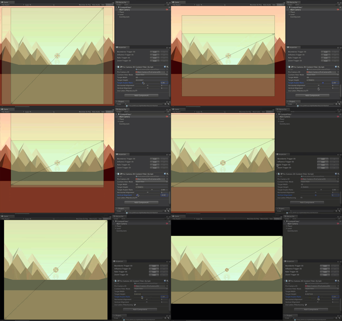
A simpler way is to use the Content Fitter extension for Pro Camera 2D and get done with it, but I’m not here to advertise it. :)

Feel free to reach me on Twitter or use the form below. I'll usually reply within 48 hours.

